
Pretty in Pastels...aka The New Neutrals
Anyone who follows our Instagram feed or Pinterest boards will know that we are big fans of the new pastels that are dominating the design world right now.
From the catwalk to the corporate via every walk of design life, pastels are fast becoming the backdrop to our colour palette. Have we seen the back of white or pale grey walls (for a while anyway)?
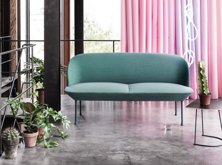
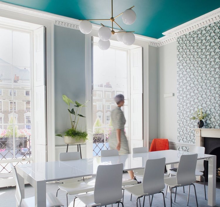
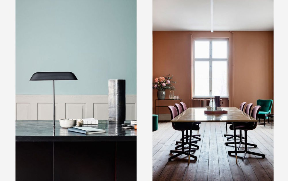
Soft pinks to chalky mint green via baby blues and gentle oranges, pastels can be calming or fresh depending on what colours you pair them with. Below is the Oslo sofa from Muuto in a strong but soft green looking very modern against neon and foliage. When we recently completed a project for Acacia Avenue we used a very gentle blue on the walls of this meeting room but then punched it up with a bright teal ceiling.
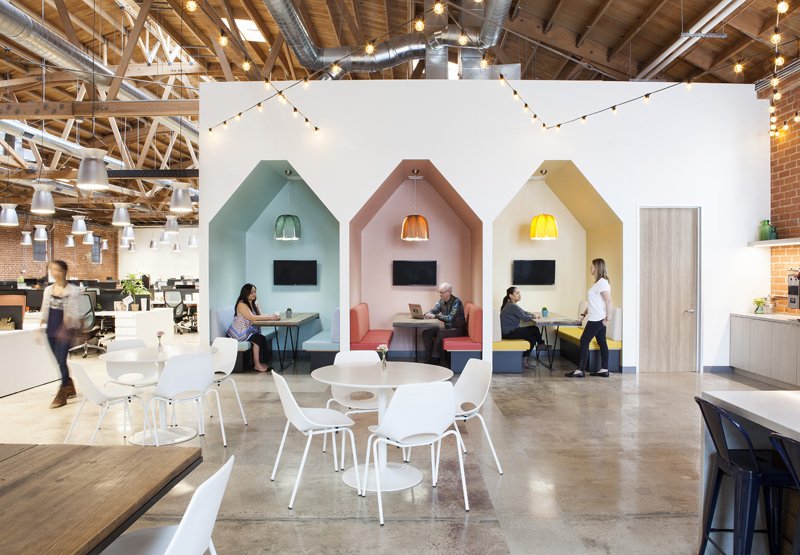
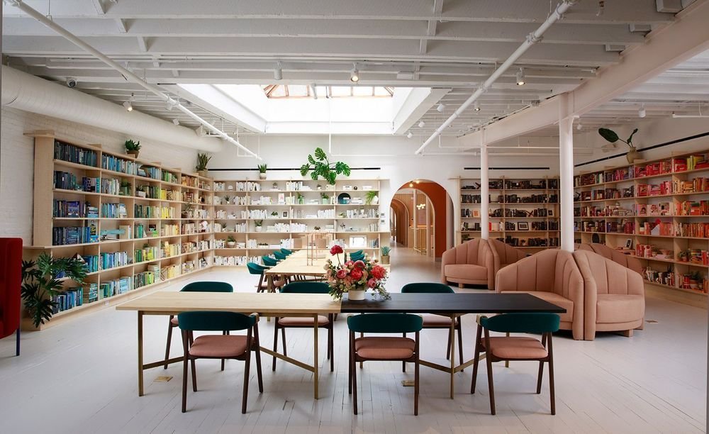
We love the use of pastels for these meeting booths in The Bouqs new space designed by Walcott Architecture in California. And of course, our hats are always off to Danish design and the co-workspace Nomad in Copenhagen is no exception. Our lead image is from the ultra-cool and very pastel friendly The Wing in NYC, a women only workspace (just don't say it's girly).
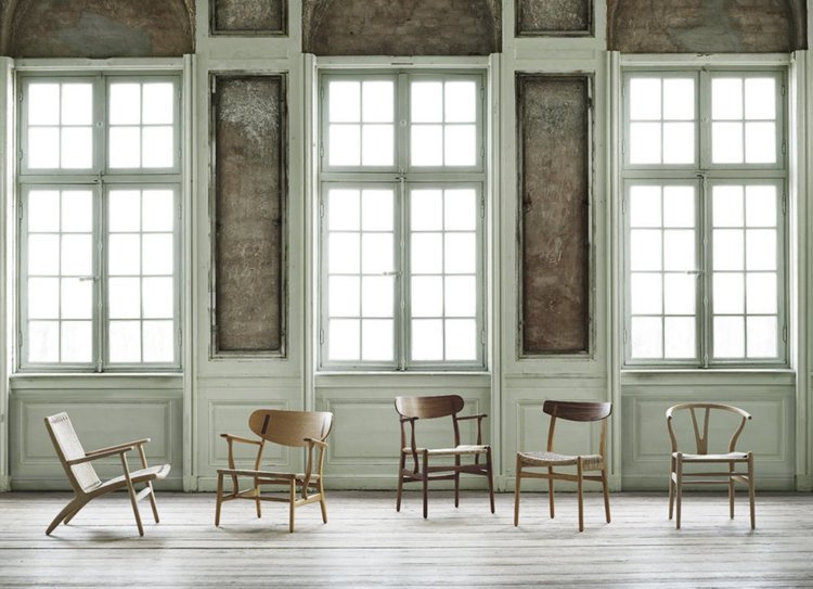
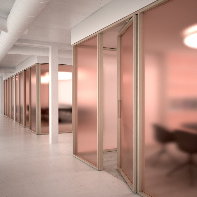
These wood frame partitions from 3form provide a breath of fresh air from hard framed and glass structures and the beautiful wooden chairs from Carl Hansen look stunning against the faded grandeur of a soft green palette.
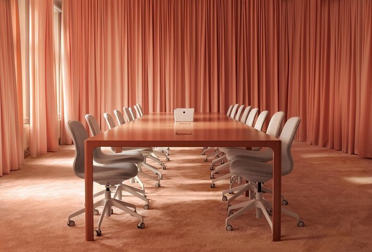
Hats off to IKEA for this beautifully brave conference room in their new Creative Hub in Malmo, Sweden. There are even pink pin boarded walls hiding behind those curtains. We heartily recommend a full read about this space in the Dezeen article linked in the image. Other sources of inspiration can come via Pinterest and we are particularly loving Dulux Australia's fantastic website and this Escapade colour palette especially - bold and fresh pastels in action.

With the trend looking to continue into 2019, it's definitely not too late to inject some pastels into your space, be it work or home.
Be brave and pretty it up!