
COLOUR: A LOVE LETTER TO THE LAST 15 YEARS

Even with such a huge expanse of surfaces we couldn’t cover, a large volume of personality and colour were injected with a pastel rainbow installation piece hung about the collaboration zones at moo.com
2010–2025, through a Trifle-tinted lens
If the last decade and a half has taught us anything, it’s that colour is not just decorative — it’s deeply emotional and deeply personal. At Trifle* we've never been shy about colour. We champion it. We study it. We absorb it from the world around us. We play with it until it tells the right story.
From workplaces and retail to homes and hybrid spaces, we’ve seen a wonderful evolution in how colour is used — and who gets to decide what “good” looks like.

Rich and warming earthy tones create an inviting and grand space in this Grade II project for Paul Mellon Centre
What We’ve Loved
Oh, pink. You shapeshifter. From Millennial Blush to sulking rooms to Gen Z Bubblegum, you’ve been through it all — and we’re still not bored. Used cleverly, pink is a powerhouse: warm, calming, subversive, unexpectedly neutral.
And let’s talk about the rise of alternative neutrals. White is no longer the default setting. Soft greens, muddy ochres, earthy terracottas, dusky mauves And blue-greys — these tones have stepped in as quiet heroes. They bring depth and personality, without screaming for attention.
Bold doesn’t mean brash. We’ve loved designing palettes that are rich and daring, without being overwhelming. We will never tire of the endless possibilities with green and pink. Mustard with blue. Navy and red/orange/peach. These combinations create rhythm, emotion, and joy.
How We Use It
We treat colour as a material in its own right — not an afterthought or an accent. It guides space planning, defines zones, and influences wellbeing. We use colour to solve problems, not just decorate around them.
In workspaces, colour creates mood and clarity — energising teams, calming focus zones, signalling purpose. In retail and showrooms, it can help tell a brand’s story, make products sing, and invites people in. At home, it’s about identity and feeling: sanctuary, stimulation, self-expression.
We think of colour as part of the architecture of experience.
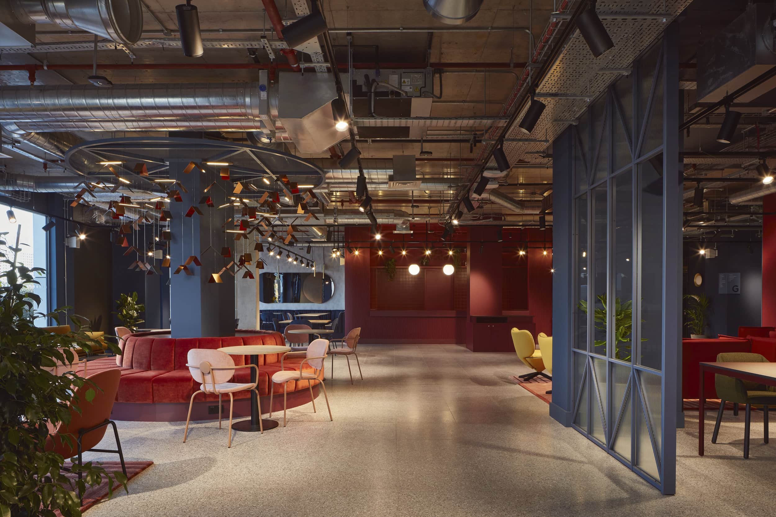
Spaces are zoned by bold colour here at the communal area within Workspace Group’s Mirrorworks building

The boardroom at moo.com features pops of brand colour inviting personality in every space
Human-Centred, Always
Design is never neutral, and neither is colour. That’s why our approach is grounded in inclusive, human-centred thinking.
We work hard to understand how people perceive and feel in a space — and how colour impacts that. For neurodiverse users, colour can mean clarity or chaos. For people with visual impairments, contrast and tone are vital. For communities who’ve been excluded from design narratives, bold use of colour can be an act of joy, presence, and reclamation.
So we don’t impose taste — we invite collaboration. We listen. We explore palettes that reflect the people who use the space, not just those who signed off the budget.
Where We’re Going Next
We’ll continue to push for brave choices — not loud for loud’s sake, but considered, joyful, energising. We’ll keep championing colour as a tool for better, more human spaces. And we’ll keep telling clients: don’t be afraid of it. Colour is permission. It’s attitude. It’s possibility.
We’re not here to play it safe — we’re here to make it sing.
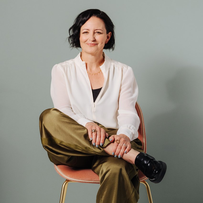
Author: Emma Morley, Director, Trifle*
Emma founded Trifle* in 2010 after a career in marketing, event design and production. Frustrated by the fact that only advertising agencies had inspiring spaces she had a desire to make good design the norm for all office workers. Emma has worked across well over 150 interior projects during her career at the helm of Trifle*, she remains passionate about making amazing spaces but also making the industry more accessible, more human and more diverse.