
Interior Colour Theory: How to Use Colour with Confidence
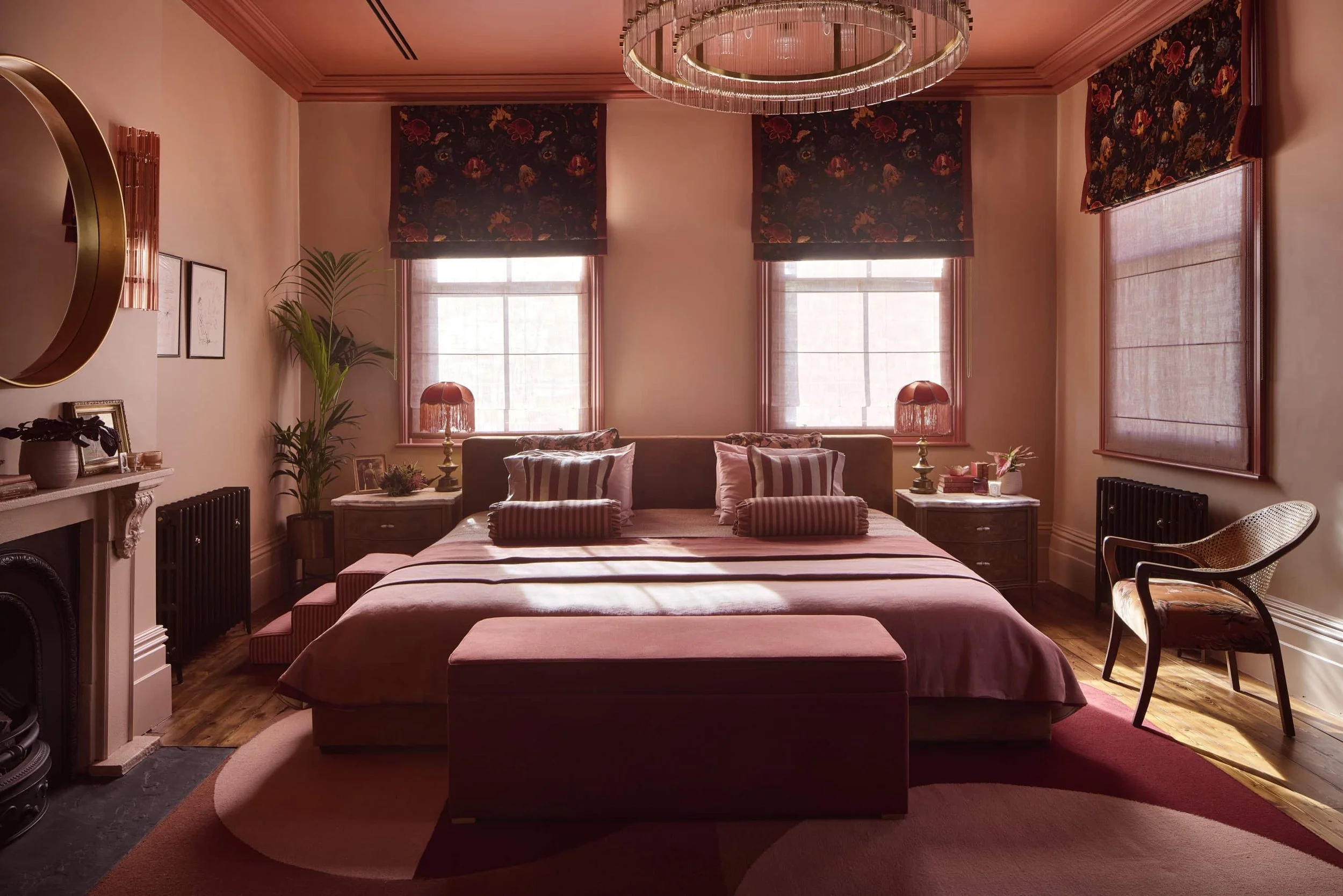
This colour drenched master bedroom in our Duke of Norfolk project creates a dramatic, immersive and rich experience
From Blocking to Drenching, Tonal Schemes and Colour Capping
Colour isn’t just about what you choose — it’s about how you apply it.
In interior design, colour theory goes beyond palettes into technique. The same colour can feel energising, calming, dramatic or subtle depending on how it’s layered, blocked or extended across a space. Understanding how to use colour is what separates confident interiors from accidental ones.
Below, we break down some of the most effective colour approaches used in contemporary interiors — and how to get each one right.
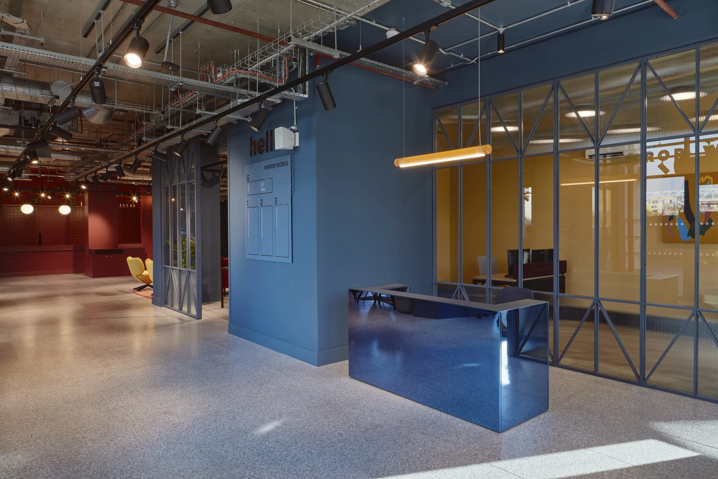
This colour blocked space at our Mirrorworks project helped to distinguish zones
Colour Blocking
Colour blocking uses distinct areas of solid colour to define zones, create contrast or add graphic impact. Think bold transitions between colours rather than soft blends. It’s great for bringing energy and visual interest to a space and defining zones.
It’s particularly effective in:
Workspaces (to define zones without walls)
Open-plan homes
Playful or creative environments
How to use it well
Choose one dominant colour and one or two supporting colours
Use architectural lines to guide blocks (walls, columns, joinery edges)
Keep the palette tight — too many colours dilute the effect
Balance bold blocks with calmer surfaces nearby
Pro tip: Colour blocking doesn’t have to mean brash. Muted or earthy tones can block just as effectively as brights.
Tonal Colour Schemes
A tonal scheme uses different shades, tints and depths of the same colour. It’s subtle, layered and incredibly versatile. It can help create a calm, cohesive environment that can add sophistication.
It’s great for:
Residential interiors
Calm workspaces
Spaces where longevity matters
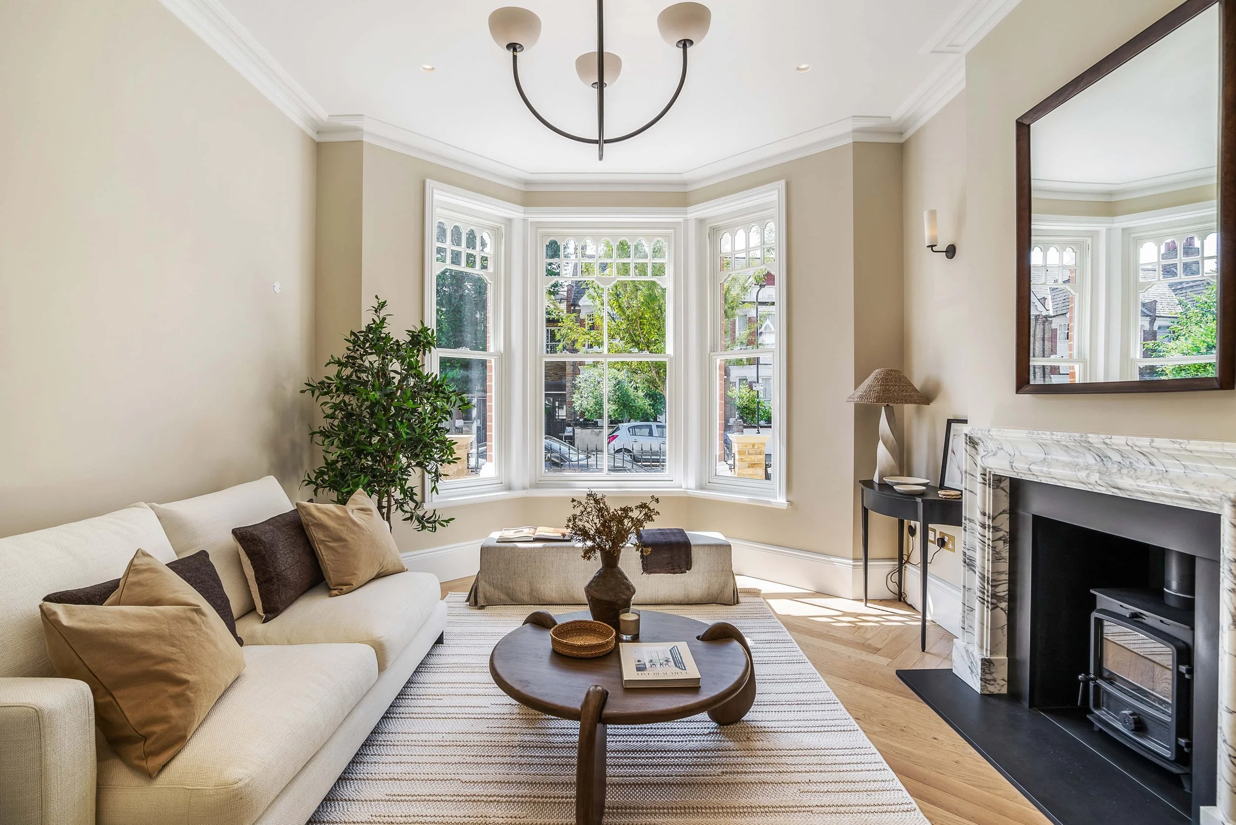
This tonal living room created a calm environment for potential buyers to imagine themselves relaxing in
How to use it well
Mix light, mid and deep tones of the same colour family
Introduce contrast through texture, not colour
Use darker tones lower in the room, lighter tones higher
Bring in variation through materials (paint, fabric, timber, stone)
Pro tip: Tonal schemes feel flat only when texture is ignored. Layer finishes generously.
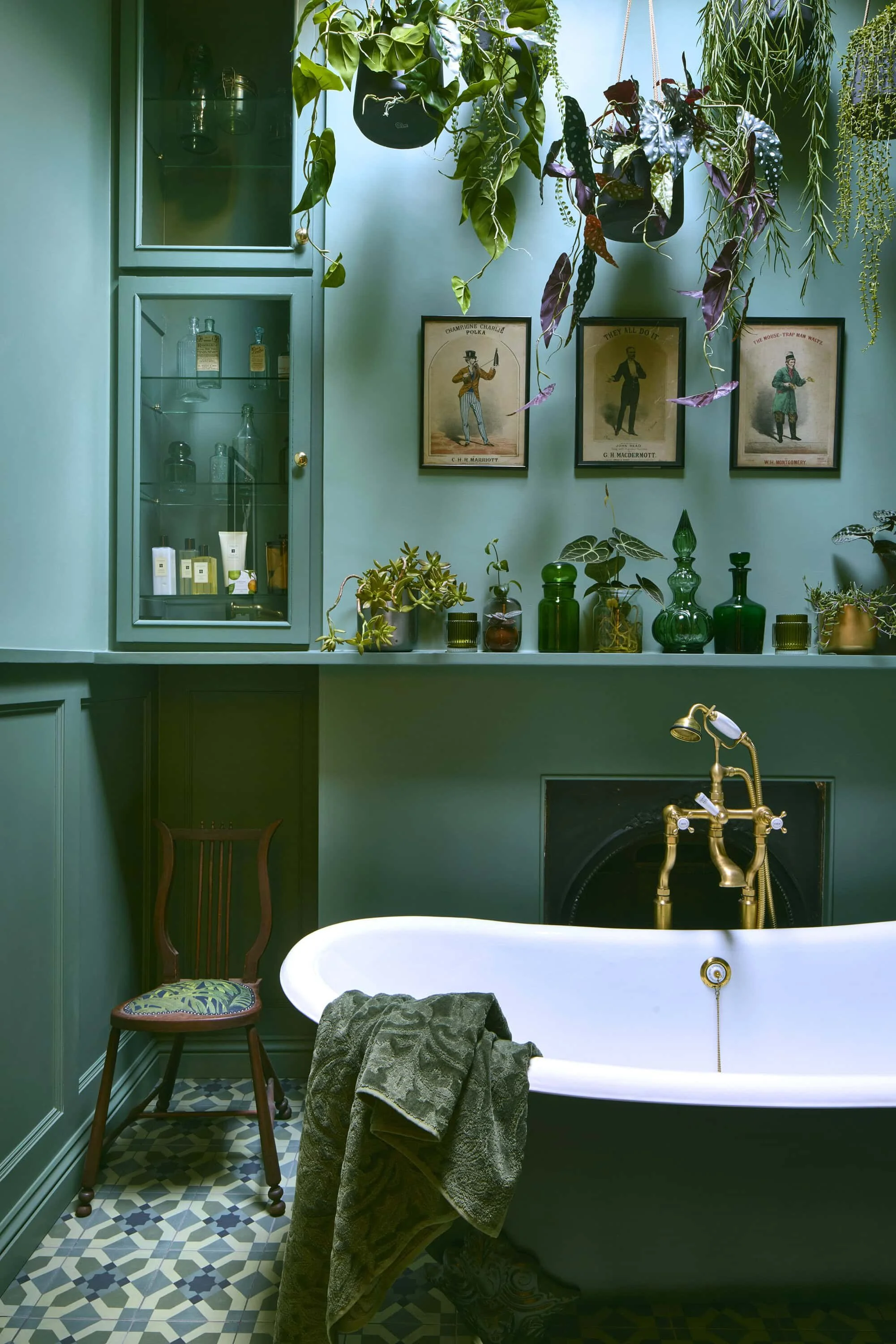
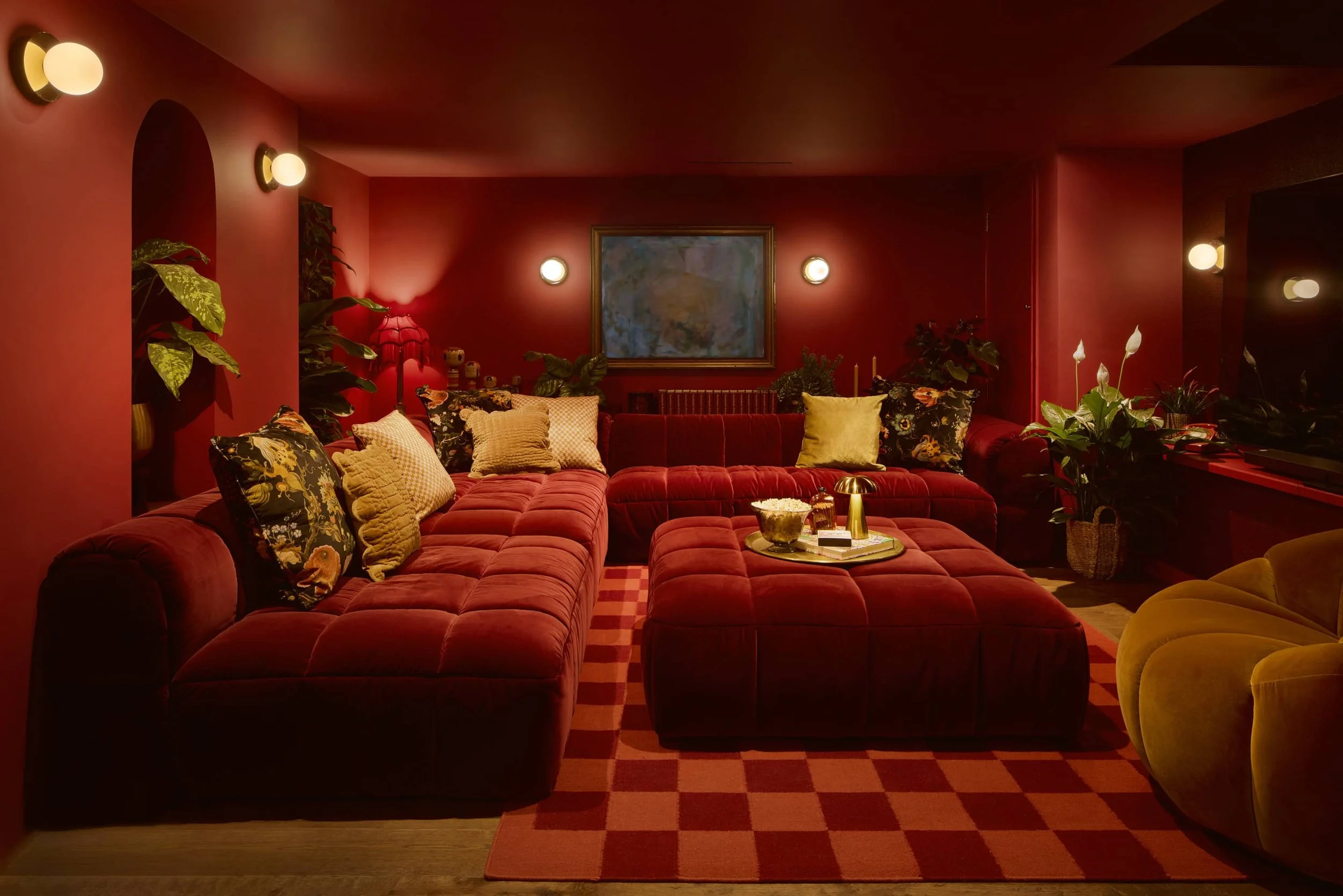
This colour drenched bathroom created a sanctuary space
Colour Drenching
Colour drenching means applying one colour across walls, ceilings, woodwork and sometimes furniture. It creates a fully immersive environment. It helps create drama, mood by immersing you in the space.
It works beautifully in:
Bedrooms
Snugs and lounges
Meeting rooms and breakout spaces
Smaller rooms (yes — really)
How to use it well
Choose a colour with enough depth to carry the space
Commit fully — partial drenching looks hesitant
Let lighting do the work: layered lighting is essential
Balance with neutral floors or soft furnishings if needed
Pro tip: Dark colours often work better than pale ones when drenching — they’re more forgiving and more atmospheric.
Colour Capping
Colour capping involves applying colour to the upper portion of a room — often the ceiling and the top section of walls — leaving the lower walls lighter or neutral. It great for emphasising architectural features. It’s more simplistic approach can help create a sense of clarity.
It’s a smart, architectural move that can:
Visually lower high ceilings
Add interest without overwhelming
Frame a space beautifully
How to use it well
Use a clear horizontal line (dado, shadow gap or colour change)
Keep the lower half calm and light
Choose colours with warmth — harsh tones feel heavy overhead
Consider capping with a deeper version of a wall colour
Pro tip: Colour capping is ideal for clients nervous about full colour commitment.

At our Beulah Road project, the colour capping helped accentuate the high ceilings and the structure of the space
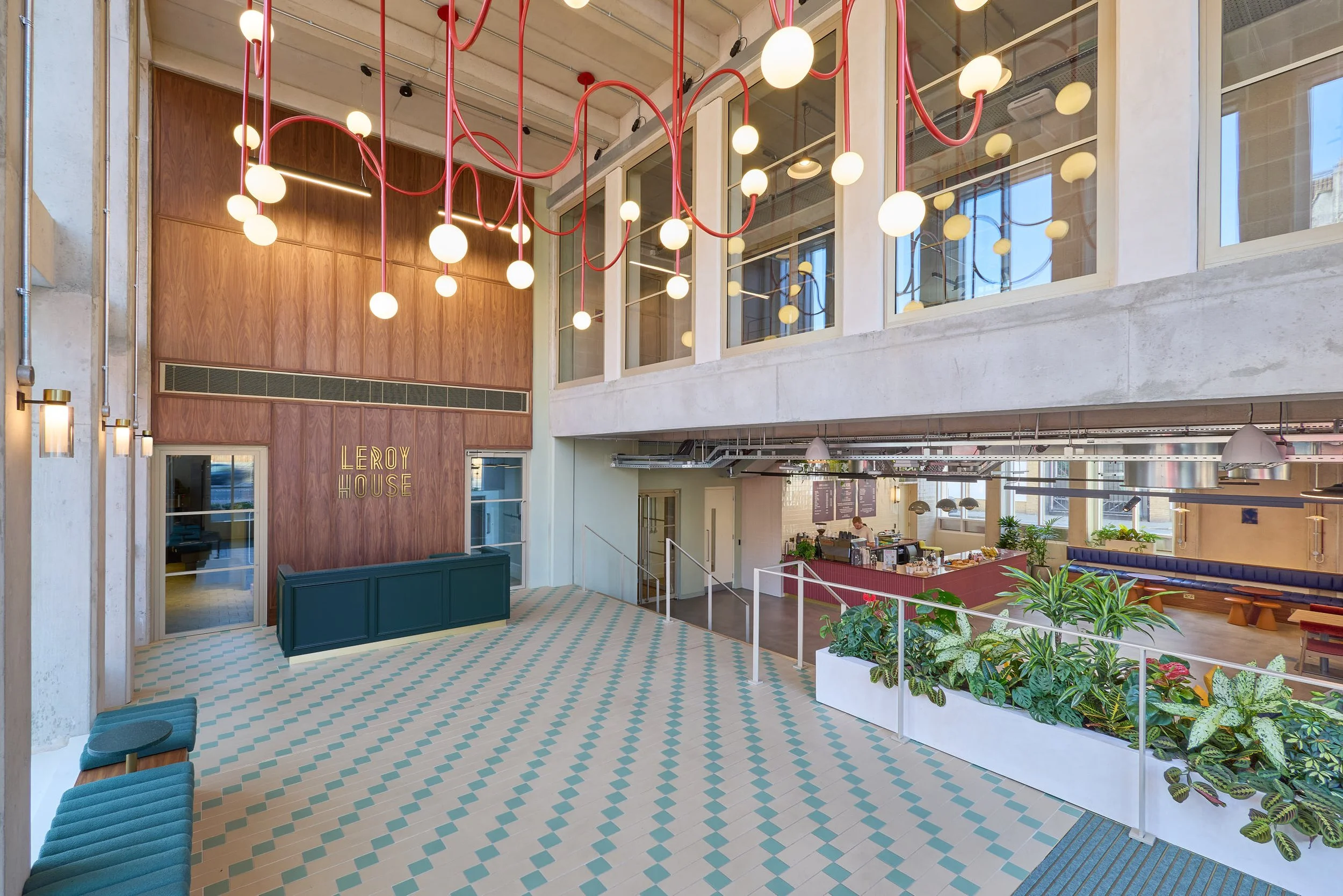
At our Leroy House project for Workspace, a red accent was used on key features within the space. It helped create visual interest with it’s pops through the scheme.
Accent Colour & “Red Theory” Moments
This is about one confident colour moment — a chair, a door, joinery, artwork — that anchors the space. It creates a space that feels intentional and the pop of colour brings energy and focus.
Popularised recently as “red theory”, the principle applies to any strong colour.
How to use it well
Choose one focal element, not several
Place it where the eye naturally lands
Let it contrast with the surrounding palette
Keep everything else considered and calm
Pro tip: Accent colours work best when the rest of the room is already resolved.
Blocking vs Tonal vs Drenching: How to Choose
Ask yourself:
Is the space about energy or calm?
Do you want definition or cohesion?
How long does the space need to last?
Who is using it — and how?
There’s no hierarchy here. The strongest interiors often combine approaches — tonal backdrops with colour-blocked moments, or drenched rooms punctuated with a single accent.


Using Colour with Confidence
The biggest mistake with colour isn’t being bold — it’s being unsure.
Confident colour use comes from:
Understanding light
Respecting architecture
Committing to an approach
Designing for feeling, not fashion
In 2026, colour in interiors is about emotional intelligence — creating spaces that support wellbeing, creativity, focus and connection. Whether you block it, tone it, drench it or cap it, colour works best when it’s intentional.
And if in doubt? Start with one brave move.

Author: Emma Morley, Director, Trifle*
Emma founded Trifle* in 2010 after a career in marketing, event design and production. Frustrated by the fact that only advertising agencies had inspiring spaces she had a desire to make good design the norm for all office workers. Emma has worked across well over 150 interior projects during her career at the helm of Trifle*, she remains passionate about making amazing spaces but also making the industry more accessible, more human and more diverse.